Anatomy of an Apple Wallet Pass: Every Field Explained
See exactly where every field lands on an Apple Wallet pass. Interactive preview + JSON examples for primaryFields, headerFields, barcode, strip images, and more.
iOS 27 note (June 2026): At WWDC 2026 Apple announced additions to the pass format: a new Poster Generic pass style with full-bleed artwork, four more barcode formats (EAN-13, Code 39, Codabar, ITF), and Featured Actions buttons on the pass face, plus a new Pass Designer app for building pass templates. iOS 27 is not publicly released yet; everything below describes the pass format as it ships today. We will update this guide once iOS 27 is out. The full announcement rundown is in our I/O 2026 and WWDC 2026 Wallet roundup.
An Apple Wallet pass looks simple — a colored card with some text and a barcode. But under the surface, every pixel on that card maps to a specific JSON key in the pass.json file inside a .pkpass bundle. If you’re building wallet passes via an API or with code, understanding this mapping is the difference between a pass that looks polished and one where fields collide, text truncates, or images disappear.
This guide walks through every field on a wallet pass, front and back, with the exact JSON you’d write and where it renders visually. Try editing the fields in the interactive preview below to see how each one maps to the pass.
What is a wallet pass?
A wallet pass is a digital card that lives in Apple Wallet (or Google Wallet). Boarding passes, loyalty cards, event tickets, coupons, membership cards — anything you’d carry in a physical wallet can become a pass.
From a technical perspective, a wallet pass is a .pkpass file. It’s a signed ZIP archive containing a pass.json file (the data), image assets, a manifest, and a cryptographic signature. When a user taps “Add to Apple Wallet,” iOS verifies the signature, reads the JSON, and renders the pass.
What makes wallet passes more useful than a PDF or a screenshot:
- They update after install. A pass that points at a web service can be refreshed remotely — change a field on the server, every device with the pass installed pulls the new content within seconds. A flight gate change, a new point balance, a refreshed QR code.
- They notify. When content changes, the device wakes via an Apple Push Notification and shows a banner on the lock screen — with text you control via the
changeMessagetemplate (“You earned 50 points”). - They’re location-aware. A pass can carry up to 10 location triggers; Wallet surfaces it on the lock screen when the device is near one of them.
- They’re scannable. Built-in barcode rendering (QR, PDF417, Aztec, Code128) with no extra libraries.
We’ll get into the JSON for each of those further down — webServiceURL + authenticationToken for updates, locations for lock-screen relevance, changeMessage on individual fields for the banner text.
Users add passes by tapping a link, opening an email attachment, scanning a QR code, or through an in-app button. The file’s MIME type (application/vnd.apple.pkpass) tells iOS to open it in Wallet.
The pkpass file format
Rename any .pkpass file to .zip and unzip it. Inside you’ll find:
MyPass.pkpass/
├── pass.json          # All pass data — fields, colors, barcode, metadata
├── manifest.json      # SHA-1 hash of every other file (integrity check)
├── signature           # PKCS#7 detached signature over manifest.json
├── icon.png           # Required. Shown in iOS notifications + search (29×29 pt)
├── [email protected]        # Retina variant (58×58 px)
├── logo.png           # Top-left of pass face (up to 160×50 pt)
├── [email protected]
├── strip.png          # Optional. Wide banner behind primary fields (375×98–144 pt)
├── [email protected]
├── thumbnail.png      # Optional. Small image, top-right of pass face (90×90 pt)
├── [email protected]
└── en.lproj/          # Optional. Localization folder
    └── pass.strings
A common point of confusion: icon.png and logo.png are different things.
icon.pngis the small square shown in the iOS lock-screen notification banner when the pass updates, and in Wallet search results. It’s the pass’s “app icon.” 29×29 pt at @1x.logo.pngrenders on the face of the pass itself, top-left. It’s the brand wordmark — Bayroast Coffee’s logo, an airline’s logo, etc.thumbnail.pngis a square slot on the pass face, top-right — typically a customer photo, product image, or secondary brand mark.strip.pngis a wide banner that spans the top of the pass face onstoreCard,coupon, andeventTicketstyles.
If you supply only logo.png, the lock-screen notification falls back to a generic placeholder icon. To brand the notification too, supply icon.png (or iconURL in the API). To get a face image visible at full color on the pass face, use thumbnailURL — logoURL renders the brand mark only.
Required files: pass.json, manifest.json, signature, icon.png (plus [email protected] for Retina). Everything else is optional.
manifest.json is a dictionary mapping every filename to its SHA-1 hash. iOS uses this to verify that nothing in the archive has been tampered with.
signature is a PKCS#7 detached signature created with your Apple Developer pass signing certificate and the Apple WWDR (Worldwide Developer Relations) intermediate certificate. This is the part that tells iOS “this pass was created by an authorized developer.” It’s also the part that burns the most time if you’re building the signing pipeline yourself.
Image variants: iOS picks the highest-resolution variant that fits the device. Provide @2x assets at minimum — nearly all current iPhones are Retina. The @3x suffix is supported for Plus/Max-sized phones.
The maximum recommended size for a .pkpass file is around 1.5 MB. Keep images optimized — the pass needs to download quickly when a user taps “Add to Apple Wallet.”
Pass styles
Every pass has a style that determines its visual layout and which image slots are available. You set the style in pass.json by using the style name as a top-level key:
{
  "formatVersion": 1,
  "generic": {
    "primaryFields": [...],
    "secondaryFields": [...]
  }
}
The five styles:
| Style | JSON key | Best for | Supported images |
|---|---|---|---|
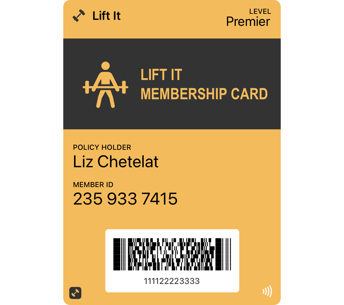
| Generic | generic | Membership cards, IDs, any general-purpose pass | logo, icon, thumbnail |
| Store Card | storeCard | Loyalty cards, gift cards, points cards | logo, icon, strip |
| Event Ticket | eventTicket | Concerts, movies, sports, conferences | logo, icon, strip OR (background + thumbnail) |
| Coupon | coupon | Discounts, special offers, promo codes | logo, icon, strip |
| Boarding Pass | boardingPass | Flights, trains, buses, ferries | logo, icon, footer |
Here’s what each style looks like — notice how the field layout and visual signature differ:
generic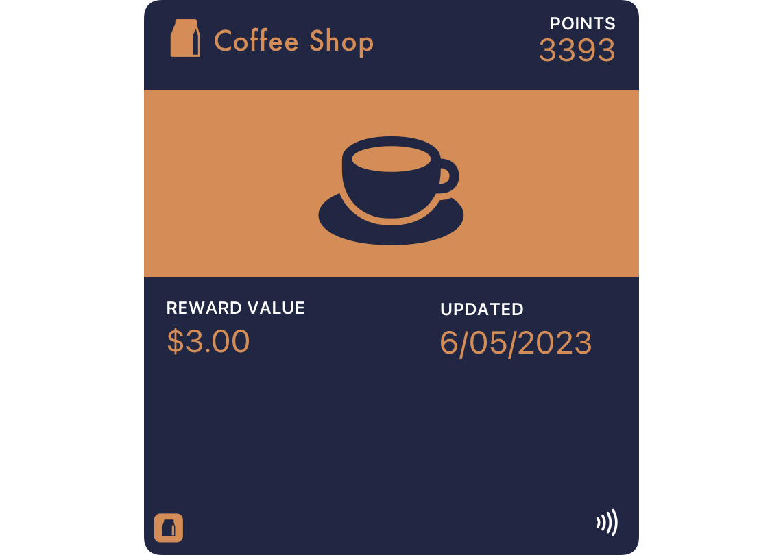
storeCard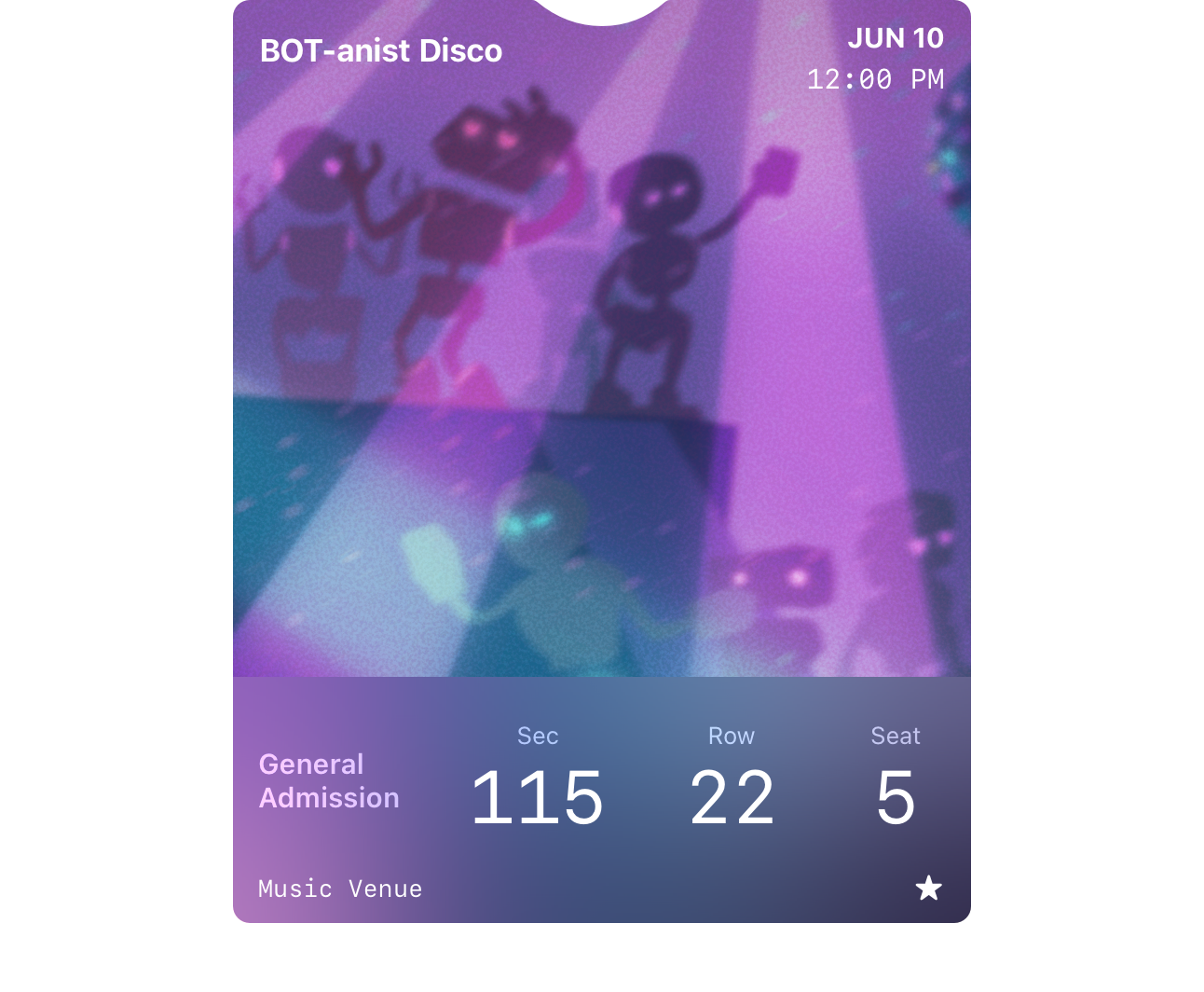
eventTicket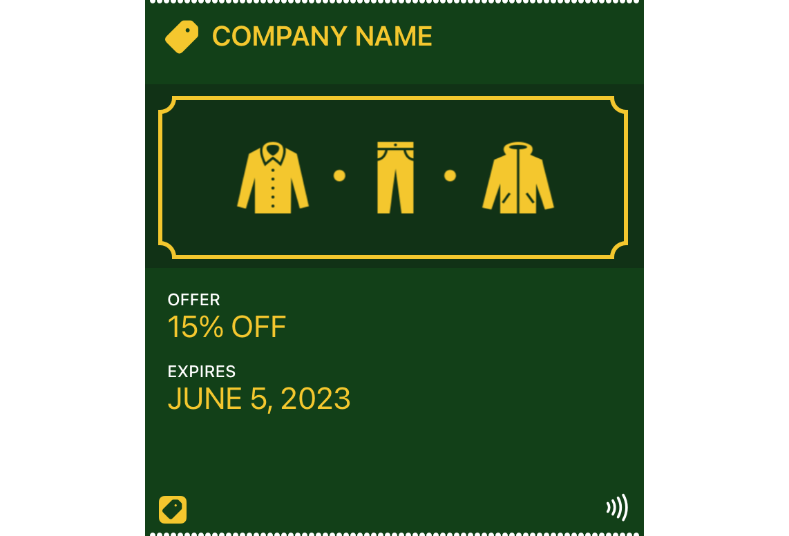
coupon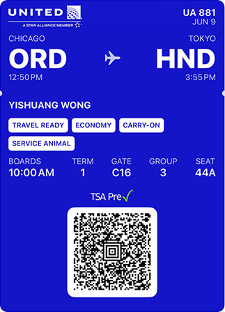
boardingPassImages from Apple Developer Documentation.
Each style has a distinct visual signature — boarding passes have a transit icon between origin and destination, coupons have a perforated top edge, event tickets have a small notch. You can’t change these details; they’re baked into iOS.
Choosing a style: Pick the one closest to your use case. If nothing fits, use generic. You can’t change the style after issuing a pass (it’s tied to the passTypeIdentifier), so decide up front.
A note on images by style: Event tickets are the most flexible — they support strip, background, AND thumbnail images, though if you use a strip, you can’t also use a background or thumbnail. Generic passes only support thumbnails (no strip). Store cards and coupons only support strip (no thumbnail).
Front of the pass — field by field
Here’s where the abstract JSON keys become real pixels on screen. Each field area has a specific location, a specific capacity, and specific truncation behavior.
A quick orientation: field arrays in pass.json contain objects with key, label, and value. The key is an internal identifier (not displayed). The label appears as small uppercase text above the value. Any field can also carry an optional changeMessage — a template iOS substitutes onto the lock-screen banner when this field’s value changes during an update:
{
  "primaryFields": [
    {
      "key": "member-name",
      "label": "MEMBER",
      "value": "Jane Cooper"
    }
  ],
  "secondaryFields": [
    {
      "key": "points",
      "label": "POINTS",
      "value": "1250",
      "changeMessage": "You now have %@ points"
    }
  ]
}
If points later goes from 1250 to 1500, the lock-screen banner reads “You now have 1500 points”. Without changeMessage, iOS falls back to the generic “Pass Updated” text. %@ is the substitution token for the new value.
Logo and logoText
Position: Top-left of the pass.
The logo image (logo.png) renders in the top-left corner, followed by logoText — a string that appears next to the logo. Together they identify who issued the pass.
{
  "logoText": "Bayroast Coffee",
  ...
}
Sizing: The logo image should be up to 160×50 points (@1x). At @2x, that’s 320×100 pixels. Keep it simple — a wordmark or icon that’s legible at small sizes.
If you provide logoText but no logo image, the text still renders. If you provide neither, the top-left is blank. If both are set, they appear side by side.
Watch the length of logoText — if it’s too long, it collides with header fields on the right. Around 15–20 characters is a safe maximum, depending on the font width and how many header fields you have.
Header fields
Position: Top-right of the pass.
JSON key: headerFields
{
  "headerFields": [
    {
      "key": "balance",
      "label": "POINTS",
      "value": "1,250"
    }
  ]
}
Header fields are special because they’re the only fields visible when the pass is stacked in the Wallet app. When a user has multiple passes, they see a stack of cards with just the top sliver — logo, logoText, and header fields. This makes header fields the most valuable real estate on the entire pass.
Use them for the single most important dynamic value: a point balance, a flight status, an event date, a seat number.
You can have up to 3 header fields, but in practice 1–2 is ideal. Each one takes horizontal space, and they share the top-right with the thumbnail image on generic and event ticket passes. The label always shows above the value in small text.
Primary fields
Position: The large, bold row in the center of the pass.
JSON key: primaryFields
{
  "primaryFields": [
    {
      "key": "event-name",
      "label": "EVENT",
      "value": "Summer Music Festival"
    }
  ]
}
Primary fields display the most important information on the pass — the thing the user needs to see at a glance. The value renders in a large, prominent font.
Capacity: Most pass styles support 1 primary field. Boarding passes are the exception — they support 2, rendered side by side with a transit icon (plane, train, bus, ferry) between them.
Truncation: Primary field values truncate at roughly 20–25 characters on most devices, depending on the font and device width. iOS does not wrap text — if there is too much text, fields may not be displayed at all. Keep primary values short and impactful.
Secondary fields
Position: Below the primary fields.
JSON key: secondaryFields
{
  "secondaryFields": [
    {
      "key": "member-since",
      "label": "MEMBER SINCE",
      "value": "2024"
    },
    {
      "key": "tier",
      "label": "TIER",
      "value": "Gold"
    }
  ]
}
Secondary fields show supporting information. Multiple fields sit side by side, dividing the available width equally. Labels always appear above their values.
Capacity: Up to 4 secondary fields on most styles. However, on coupons, store cards, and generic passes with a square barcode (QR or Aztec), the secondary and auxiliary fields share a combined limit of 4 total. If you have 2 secondary and 3 auxiliary, only 4 will render.
When field text is too long, iOS truncates individual values rather than dropping entire fields — but it’s better to keep values concise.
Auxiliary fields
Position: Below or alongside secondary fields, depending on pass style.
JSON key: auxiliaryFields
{
  "auxiliaryFields": [
    {
      "key": "gate",
      "label": "GATE",
      "value": "B12"
    }
  ]
}
Auxiliary fields behave similarly to secondary fields but are treated as a separate row. On boarding passes, up to 5 auxiliary fields can appear (more than other styles). On other styles, they share the combined 4-field limit with secondary fields.
The visual difference between secondary and auxiliary fields is subtle — they use the same font size and styling. The distinction is mainly about layout order and how Apple Watch renders them (auxiliary fields appear after secondary fields, each on their own line).
Strip image and thumbnail
These are the two image slots that appear on the front of a pass (besides the logo). Which one you get depends on the pass style.
Strip image (strip.png): A wide banner that sits behind the primary fields. Supported on store cards, coupons, and event tickets.
- Recommended size: 375×123 points (@1x) for most styles — but 375×98 pt for event tickets and 375×144 pt for coupons and gift cards
- The strip spans the full width of the pass
- Text renders on top of the strip — make sure your
foregroundColorcontrasts with the image - On Apple Watch, the strip image is not displayed
What happens to the layout when you add a strip: The strip image becomes the background of the primary fields area. The primary field labels and values render directly on top of the image. This means busy or bright images can make your text unreadable — use a darker image, or overlay it with your backgroundColor at reduced opacity. Because of this, secondary fields become more important in strip layouts — they sit below the strip on a solid background and are always legible. If you have information that must be readable at a glance, put it in secondary fields rather than primary when using a strip.
Thumbnail (thumbnail.png): A small image in the top-right area, next to the header fields. Supported on generic passes and event tickets (when not using a strip).
- Allotted space: 90×90 points (@1x), so 180×180 pixels at @2x. Aspect ratio can range from 2:3 to 3:2
- Good use cases: user profile photo, product image, company logo mark
- Renders with rounded corners automatically
You can’t use both on the same pass. On event tickets, if you provide a strip image, the thumbnail and background are ignored. Choose based on your content: strip for branded visual impact, thumbnail for personalization.
Barcode
Position: Bottom of the pass, centered.
JSON key: barcodes (array)
{
  "barcodes": [
    {
      "format": "PKBarcodeFormatQR",
      "message": "MEMBER-12345-GOLD",
      "messageEncoding": "iso-8859-1",
      "altText": "MEMBER-12345-GOLD"
    }
  ]
}
Four barcode formats are supported:
| Format | JSON value | Best for |
|---|---|---|
| QR | PKBarcodeFormatQR | Most use cases. Compact, fast to scan |
| PDF417 | PKBarcodeFormatPDF417 | Legacy systems, some event venues |
| Aztec | PKBarcodeFormatAztec | Transit systems (used by many airlines) |
| Code128 | PKBarcodeFormatCode128 | Retail POS scanners, simple numeric codes |
Why is barcodes an array? It’s a fallback chain. iOS renders the first format it supports. This matters because the older barcode key (singular) only supported one format and was deprecated in iOS 9. Always use the barcodes array. You can include the legacy barcode key alongside it for backward compatibility with very old devices.
altText appears below the barcode as a human-readable string — useful when a scanner fails and someone needs to type the code manually.
A pass can have no barcode — it’s optional. Membership cards that rely on NFC or visual verification don’t need one.
NFC: Contactless scanning uses a separate top-level nfc key, not the barcodes array. NFC passes require Apple’s explicit approval and are typically reserved for payment and transit integrations.
Back of the pass
Tap the info button (ⓘ) on any pass to flip it over. The back is a scrollable list of fields — no layout constraints, no truncation limits.
{
  "backFields": [
    {
      "key": "terms",
      "label": "TERMS & CONDITIONS",
      "value": "This pass is valid for one year from the date of issue. Points expire 90 days after last activity. See example.com/terms for full details."
    },
    {
      "key": "support",
      "label": "SUPPORT",
      "value": "https://example.com/support"
    },
    {
      "key": "phone",
      "label": "CUSTOMER SERVICE",
      "value": "+1 (555) 123-4567"
    }
  ]
}
Auto-linking: iOS automatically detects and makes tappable:
- URLs — opens Safari
- Phone numbers — opens Phone
- Email addresses — opens Mail
- Street addresses — opens Maps
No HTML or markdown is supported. It’s plain text with smart detection.
No practical limit on the number of back fields. Use the back for everything that doesn’t need to be visible at a glance: terms and conditions, account IDs, support links, associated app link, detailed instructions.
The back is not available on Apple Watch — keep critical information on the front.
How passes update after install
A pass is not a static artifact — the same serial can carry different content over time. Apple Wallet’s update model is a wake-and-poll loop, not a payload push.
The pieces in pass.json that make this possible:
{
  "passTypeIdentifier": "pass.com.example.loyalty",
  "serialNumber": "8f4c3a2e-…",
  "webServiceURL": "https://api.example.com",
  "authenticationToken": "32-hex-chars-or-more"
}serialNumber— your handle for “this specific pass.” It’s how you refer to the pass when you want to update it.webServiceURL— the base URL Wallet polls for updates. Devices append paths like/v1/devices/.../registrations/...and/v1/passes/{type}/{serial}to it.authenticationToken— opaque shared secret baked into the pass. Devices send it back when they fetch updates so your server knows the request comes from a legitimately-installed pass.
What happens in practice:
- Install. The user adds the pass. iOS reads
webServiceURLfrompass.jsonand immediately callsPOST /v1/devices/{deviceLibraryIdentifier}/registrations/{passTypeIdentifier}/{serialNumber}to register, sending its APNs push token along. - Issuer changes something. Your backend updates the pass content (e.g., the points balance) and bumps a “last modified” timestamp on the server.
- Push notification. Your server fans out an APNs push to every registered device. The push payload is empty — it’s just a wake-up signal. The lock-screen text doesn’t come from the push body; it comes from any
changeMessagefield that changed. - Device polls. iOS calls
GET /v1/devices/.../registrations/...?passesUpdatedSince=<tag>to ask “what’s changed since the last time you told me?” Your server returns the list of changed serial numbers. - Device fetches new bytes. iOS calls
GET /v1/passes/{type}/{serial}(withAuthorization: ApplePass <authenticationToken>) and pulls a fresh.pkpassfile. Wallet replaces the installed pass in place.
The whole loop takes ~1–3 seconds end-to-end on a real iPhone.
You don’t have to implement any of this yourself — most Wallet pass APIs (this one included) handle the registrations table, the APNs JWT signing, and the polling endpoints. You just call PUT /api/passes/{serial} with the new content and the loop runs.
Location triggers
Wallet can surface a pass on the lock screen without a push, when the device is physically near a coordinate you set:
{
  "locations": [
    {
      "latitude": 37.331741,
      "longitude": -122.030333,
      "relevantText": "Welcome to Apple Park"
    }
  ]
}
Up to 10 locations per pass. iOS uses its significant-location-change service — meaning the surfacing isn’t instant the moment you cross the geofence; it’s tied to the device’s normal location updates and can lag a minute or two. Good for: a coffee loyalty pass surfacing at the shop’s coordinates, a stadium ticket at the venue, an event coupon at the store.
The optional relevantText (≤128 chars) is what the lock-screen banner reads when the surfacing fires.
Colors and appearance
Three color keys control how a pass looks:
{
  "backgroundColor": "rgb(30, 64, 175)",
  "foregroundColor": "rgb(255, 255, 255)",
  "labelColor": "rgb(191, 219, 254)"
}| Key | Controls | Format |
|---|---|---|
backgroundColor | Pass background color | rgb(R, G, B) |
foregroundColor | Value text color | rgb(R, G, B) |
labelColor | Label text color (the small text above values) | rgb(R, G, B) |
If you don’t set colors, iOS attempts to derive them from the logo or strip image — it samples the dominant color and picks complementary text colors. The result is often acceptable, but unpredictable. Set colors explicitly for consistent branding.
Contrast adjustment: iOS may adjust your colors if there isn’t enough contrast between foregroundColor and backgroundColor. In practice, this means your pass should always be readable — but test with your exact color combination to avoid surprises.
Common mistakes:
- Setting
labelColorthe same asforegroundColor— labels and values blend together - Dark text on a dark background (forgetting to change
foregroundColorwhen darkening the background) - Not testing on the lock screen, where the pass renders as a notification banner with different ambient lighting
Creating a wallet pass with an API
Everything above — the fields, the images, the barcode, the colors — maps directly to a single API call. Here’s a pass that uses most of the fields we’ve covered:
curl -X POST https://api.walletwallet.dev/api/passes?format=pkpass \
  -H "Authorization: Bearer YOUR_API_KEY" \
  -H "Content-Type: application/json" \
  -d '{
    "barcodeValue": "MEMBER-12345",
    "barcodeFormat": "QR",
    "logoText": "Bayroast Coffee",
    "colorPreset": "dark",
    "primaryFields": [
      { "label": "MEMBER", "value": "Jane Cooper" }
    ],
    "secondaryFields": [
      { "label": "TIER", "value": "Gold" },
      { "label": "SINCE", "value": "2024" }
    ],
    "headerFields": [
      { "label": "POINTS", "value": "1,250" }
    ],
    "backFields": [
      { "label": "TERMS", "value": "Points expire after 90 days of inactivity." },
      { "label": "SUPPORT", "value": "https://example.com/help" }
    ]
  }' \
  --output pass.pkpass
The response is a signed .pkpass file you can send to users via email, link, or an “Add to Apple Wallet” button.
Field mapping from this article to the API:
| Pass field | API parameter | Notes |
|---|---|---|
| organizationName | organizationName | Issuer name shown as the lock-screen notification title on pass updates, in the iOS share sheet, and in the Wallet pass info screen. Max 64 chars. |
| logoText | logoText | Falls back to title if not set |
| primaryFields | primaryFields | Array of {label, value, changeMessage?} |
| secondaryFields | secondaryFields | Array of {label, value, changeMessage?} |
| headerFields | headerFields | Array of {label, value, changeMessage?} |
| backFields | backFields | Array of {label, value, changeMessage?} |
| Barcode | barcodeValue + barcodeFormat | QR, PDF417, Aztec, Code128 |
| Colors | colorPreset or color (hex) | Preset: dark, blue, green, red, purple, orange |
| Logo (pass face) | logoURL (Pro) | HTTPS URL or base64 data URI |
| Thumbnail (pass face) | thumbnailURL (Pro) | HTTPS URL or base64 data URI |
| Strip (banner) | stripURL (Pro) | HTTPS URL or base64 data URI. Switches layout to storeCard. |
| Icon (notifications) | iconURL (Pro) | HTTPS URL or base64 data URI. Replaces the placeholder used in lock-screen banners. |
| Locations | locations | Up to 10 {latitude, longitude, altitude?, relevantText?} entries. |
POST returns the pass binary plus an X-Serial-Number response header — that’s your handle for pushing updates later. To update the pass content on every installed device, PUT the same body shape against /{serial}:
curl -X PUT https://api.walletwallet.dev/api/passes/$SERIAL \
  -H "Authorization: Bearer YOUR_API_KEY" \
  -H "Content-Type: application/json" \
  -d '{
    "barcodeValue": "MEMBER-12345",
    "barcodeFormat": "QR",
    "logoText": "Bayroast Coffee",
    "secondaryFields": [
      {
        "label": "POINTS",
        "value": "1500",
        "changeMessage": "You earned %@ points"
      }
    ]
  }'
The push fires automatically; every device with the pass installed banners and refreshes in place. Identical bodies are a no-op — no push, no quota.
You don’t handle certificates, signing, image bundling, registrations, or APNs JWT signing — the API does all of it. Get an API key and you can have an updatable pass in someone’s wallet in under a minute.
iOS 27 note: the anatomy above will grow this fall. iOS 27 adds the Poster Generic style (full-bleed artwork with logo, header, primary, and footer fields), EAN-13, Code 39, Codabar, and ITF to the
barcodesarray, and afeaturedActionskey for up to two tappable buttons on the pass face. None of it is publicly released yet, and we will update this guide field by field once it ships. Until then, the details are in our WWDC 2026 coverage and our Pass Designer overview.
Written by Alen Todorov, founder of WalletWallet API — the tech behind the consumer product WalletWallet, which was featured on Product Hunt, hit the Reddit frontpage, and has generated over 100,000 passes.