Google Wallet Passes Redesign (2026): What's Changing and How to Prepare
Google is redesigning Google Wallet passes in summer 2026, moving to a component-based, full-screen layout with a larger hero image and a dedicated Pass settings page. Here is what changes, whether it breaks your existing passes, and how WalletWallet is carrying your passes across.
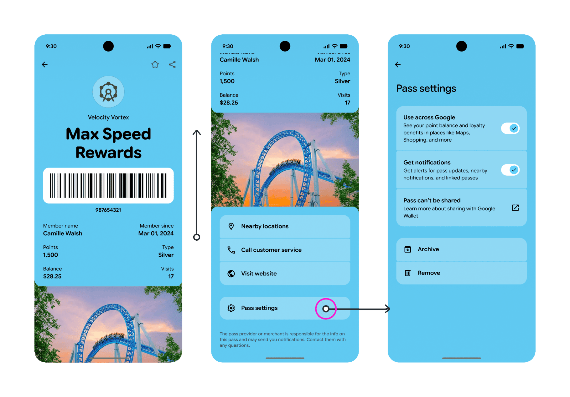
Google and Apple are both making significant changes to Wallet passes this summer, and both lean the same way: larger images and more room for your brand on the pass. Google is redesigning Google Wallet passes around a full-screen, component-based layout, while Apple’s new Poster style gives generic passes a full-bleed background image. If you issue through WalletWallet, you are covered from day one of both releases, with a single unified template that takes advantage of the new layouts on Apple and Google at once; poster passes and Featured Actions are live in the editor and the API.
Google has told Wallet partners that a full redesign of Google Wallet passes is launching in the summer of 2026, moving pass rendering to a component-based system. It covers event tickets, boarding passes, loyalty cards, offers, gift cards, and generic passes. Below is what Google is changing, whether it affects passes you have already issued, and what we are doing to carry them across.
What Google announced
Google is transitioning Wallet passes to a “component-based rendering system” that produces a richer, more customizable, and more interactive pass. The stated goal is to move every existing pass to the new design without disrupting current integrations, so passes keep working while the presentation changes underneath them. The redesign applies across event tickets, boarding passes, loyalty and membership cards, offers, gift cards, and generic passes.
The old design next to the new one
Google shared a before and after of a generic loyalty pass. The change is mostly cosmetic: a new layout for the same pass data.
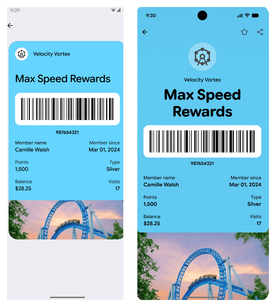
In the current design (left), the pass is a contained card on a neutral page: the brand color fills a rounded rectangle, the barcode and fields sit inside it, and a small strip image sits at the bottom. In the new design (right), the pass fills the whole screen, the title is much larger, and the hero image becomes a full-width band rather than a thin accent strip.
What changed, component by component
- Full-bleed brand color. The pass fills the screen instead of floating as a card on a grey background. Your background color now sets the tone for the entire view, so contrast against it matters more than before.
- Larger title. The program or event name is rendered at a much larger size and can wrap to two lines, so short, legible names read better than long ones.
- A prominent hero image. The hero image is now a full-width band and a primary design element rather than a thin accent strip. This is the single biggest lever you have over how the new pass looks.
- Action modules. Nearby locations, Call customer service, and Visit website render as tinted, tappable components instead of plain list rows.
- A dedicated Pass settings page. The toggles and sharing controls (Use across Google, Get notifications, sharing, Archive, and Remove) move onto their own screen, which declutters the main pass view.
Does this break your existing passes?
No. Google is explicit that the transition happens without disrupting current passes. The redesign changes how Google renders passes while the schema you send stays the same. The Class and Object JSON you already send is unchanged, the save flow is unchanged, and passes already installed on phones move to the new look automatically.
Apple and Google are both moving to bigger images
This redesign is part of a wider shift across both wallets toward bigger imagery. Apple’s new Poster style for generic passes, previewed at WWDC 2026, puts a full-bleed background image behind the logo, fields, and barcode. The same background image drives both: on Google it becomes the hero band, as described in our poster and Featured Actions update.
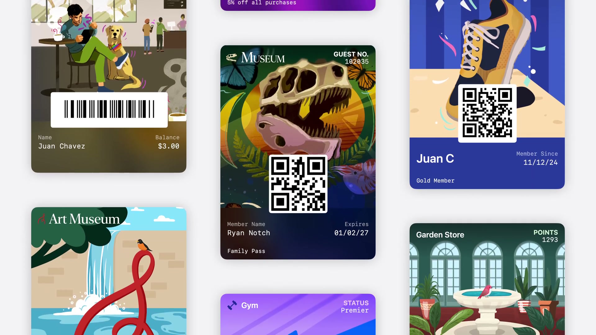
Google’s redesign does the same on the Android side by promoting the hero image to a full-width band. For issuers this points the same way on both platforms: a single strong image now carries more of the pass than the fields do, so the artwork you supply matters more than it used to. Our Google Wallet at I/O 2026 and Apple Wallet in iOS 27 roundup covers both platform previews in full.
What we are doing in the WalletWallet API
Passes you issue through WalletWallet adopt the new Google design automatically, because we create a real Google Wallet object and Google re-renders it on their side. You do not need to change your integration or reissue anything.
For the large-image direction, we are lining up support for the new image slots and specifications on both wallets so they are available from day one of the redesign. The large-image fields you already set, the Google hero image and the Apple strip, are exactly the slots these redesigns lean on, so you can prepare now:
- Set a strip image and a background color on your passes so the full-screen layout has something to fill.
- Use one
POSTto create the pass for both Apple Wallet and Google Wallet, and aPUTto update it in place on every phone it is installed on, so you can refresh branding ahead of the redesign without reissuing.
If you want the field-by-field map of where each value renders before and after the change, our anatomy of a Google Wallet pass guide walks through every field, the Class versus Object split, and the save flow, with an interactive preview.
To start, get an API key and see the docs at walletwallet.dev.
Build your first wallet pass
Turn one JSON request into a pass that installs in Apple Wallet and Google Wallet, with live updates that reach both.